Enterprise SaaS Dashboard
From Fragmented Workflows to Strategic Clarity: Unified Dashboard for Enterprise Decision-Making
PROJECT OVERVIEW
Dashboard design for an enterprise management SaaS platform connecting strategy with real-time project management.
CONTEXT
The platform manages complex, multi-layered work landscapes with interconnected goals. Users range from executives monitoring KPIs to managers tracking daily tasks.
MY ROLE
Product Designer & UX Researcher
COLLABORATION
Worked under the mentorship of the Senior Designer, who guided the research methodology and design strategy.
CHALLENGE
Users couldn't get a unified overview of their work without diving into individual tools. There was no central workspace that showed what mattered, when it was due, or how it connected to other work.
SOLUTION
Designed a unified dashboard that serves two critical purposes: (1) providing a real-time overview of progress, status and priorities across all work items, and (2) acting as a launching point for action—allowing users to quickly understand their landscape and then dive into tools with context.
RESEARCH & INSIGHTS
METHODOLOGY
User interviews with enterprise clients, behavioral analytics and competitive analysis of SaaS management tools.
KEY USER PAIN POINTS
-
Keeping track of work requires navigating across multiple tools
-
No clear mechanism to identify priority projects requiring immediate attention
-
Constant context-switching between tools reduces productivity
-
Users can't get a quick overview of project status without diving into each tool
USER SEGMENTS
-
Executive users — Need high-level metrics, KPI overview, goal progress
-
Project managers — Need timeline visibility, task distribution, team accountability
-
Team members — Need personal tasks, project membership status, deadlines
KEY INSIGHT
The core problem isn't feature overload—it's priority overload. Users need systems that highlight what matters now, hide what doesn't, and adapt based on their role and context.
KEY DESIGN DECISIONS
AI ASSISTANT AS PRIMARY NAVIGATION ENTRY POINT
Top-center chat interface allows users to search and navigate intuitively rather than hunting through menus. Reduces cognitive load by converting navigation into conversational queries.
SMART QUICK ACCESS SECTION
Users can pin their own relevant content to Quick Access for fast access to frequently-used items. Admin-highlighted cards show with a "Highlighted" chip, while user-pinned content can be rearranged or unpinned at any time. This balance between system priorities and personal customization respects both organizational needs and individual workflow preferences—solving a major friction point.
AGGREGATED METRICS OVERVIEW
Statistics section surfaces key performance indicators across projects and targets in one view. By consolidating fragmented metrics that previously required navigating multiple tools, the dashboard transforms status tracking from reactive to proactive.
INTEGRATED CALENDAR WITH FILTERING
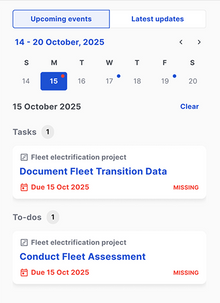
Sidebar calendar shows due dates across all user items, filterable by event type (meetings, to-dos, reports, tasks, etc) or day of week. Transforms the calendar from decorative to functional—users can identify busy periods at a glance.
CONSOLIDATED TAB SYSTEM
This section consolidates all user-relevant items into a single unified view. Tabs filter by relationship type—'My Items' displays content the user owns, edits, or participates in, while other tabs organize by tool. This replaces the friction of scattered tool navigation with one intuitive hub where users instantly understand their complete portfolio.
THE DESIGN PROCESS
1. INFORMATION ARCHITECTURE STRATEGY
-
Mapped all features and their relationships
-
Identified which features served which user personas
-
Removed redundant navigation paths
-
Created mental model for new unified structure
2. WIREFRAMING & LAYOUT EXPLORATION
-
Tested 4 different dashboard layouts
-
Evaluated placement of features
-
Validated with enterprise users through rapid prototyping
-
Gathered feedback on content structuring
3. VISUAL DESIGN & COMPONENT SYSTEM
-
Established visual hierarchy (headings, sections, cards)
-
Leveraged existing design system as foundation, adapting core components for dashboard-specific needs
-
Customized filtering and search components within existing system standards
4. PROTOTYPING & VALIDATION
-
Built high-fidelity prototype in Figma
-
Conducted usability tests with target users
-
Iterated on calendar interactions, tab navigation, and assistant visibility
-
Confirmed positive user feedback and successful task completion rates
RESULTS
DESIGN IMPACT
-
Streamlined onboarding for new users through progressive disclosure
-
Reduced cognitive load through intelligent defaults and role-based views
-
Increased feature discoverability (users explore advanced features organically)
-
Foundation for personalization and adaptive interfaces
KEY INSIGHT
ENTERPRISE DESIGN IS ABOUT REDUCING THE COST OF THINKING
The most powerful dashboard isn't the one with the most features—it's the one that requires the least cognitive effort to find what you need. By combining intelligent defaults (role-based views), smart filtering (calendar, tabs, search), and user autonomy (dismissible content), the design transforms a fragmented link page into a strategic workspace that enables expertise.


